It's been so long since I've posted and I'm saying so long too! Does "so long" mean goodbye in other parts of the world? It does here! I really enjoyed blogging about the great art kids were doing here on the Central Coast, but I became a bit distracted with my own three bundles of joy and also I started painting regularly myself. This has become my main creative outlet and I'm really enjoying it. I've included some of my paintings below to give anyone interested an idea of what I'm chasing... If you like what you see and you don't mind Instagram, you can always see more @_joe.hall_ I will keep checking in here with the art teaching blogosphere to keep inspired for my days at school, I'm always so impressed with both the teaching and what kids are capable of. All the best - Joe : )
Showing posts with label painting. Show all posts
Jun 2, 2018
May 13, 2016
Vertical Landscapes
Year one made these vertical landscapes in three steps. Initially I led a guided drawing lesson in pencil. Next, the students traced their "good" lines with black markers and did a little erasing. Finally they coloured them any way they chose with watercolour paint.
We had just completed a science unit of work about landscapes, and it seemed only appropriate to attempt this classic art form. I took inspiration from one of Kathy Barbro's many fine lessons on Art Projects For Kids. For any eagle eyes out there, please ignore the missing comma on the class display text!
Jan 28, 2015
Ming Vases
Year 5 made these Ming Vase arrangements by closely following Miriam Paternoster's fantastic art lesson found here – I had been waiting for ages to try this project with a class! The only change worth mentioning is that I gave the students a variety of vase outlines to trace instead of drawing their own. This saved some time as it's a relatively time consuming, but engrossing project : )
Jan 10, 2015
Drummers Drumming
Year 1 were very proud of their drummers, and rightly so! We began with a guided drawing lesson in lead pencil, traced the lines in oil pastel and then painted. We also retraced the black outlines after painting. My guided drawing was inspired by some CD cover art by Paula Cox, you can view it here on a previous post.
Dec 1, 2014
Australian Icons
When I ran this lesson with year 3 and 4 students, they were in the middle of an Australian theme —including a focus on Aboriginal Australia (I was lucky enough to be with the class on an excursion featuring a guided and very inspirational tour through the bush, where we were taught about the many types of bush tucker and medicine surrounding us). Another focus was Australia’s natural and man-made landmarks, so this art lesson was a way of bringing these two aspects together.
First, we talked about things that were widely recognised as being Australian cultural icons. Together we made a list (some will be obvious to readers far from Australia, and others may not), which I trimmed down to those that could be easily drawn and identified in a simple silhouette.
We also spent some time appreciating the work of Indigenous artist Bronwyn Bancroft. Looking at her children’s book Why I Love Australia, we especially noted the bright and often non-traditional colours she uses.
Then, the children chose their icon and drew it with lead pencil. Next, they painted it and the background in a different single colour. The children then used cotton buds to finish their icons with repeated dot patterns as used by many Aboriginal artists, but also using bright colours inspired by Bronywn’s art. It was quite a process from start to finish, but the children did a great job and the results are stunning.
The most popular icon turned out to be Ned Kelly, as inspired by Sidney Nolan’s famous paintings of him. For those further afield, Ned is our most infamous bushranger. Probably his most lasting legacy is the home-made helmet and armour that he sported, although as it transpired, without much success. He’s a controversial figure in our history — loved and loathed in equal measure. He was convicted of three murders, and hung in 1880 at the ripe old age of 25. Our other, less controversial icons featured here include an emu, a kangaroo, the Sydney Opera House, the Sydney Harbour Bridge, Uluru and the Three Sisters.
As well as enjoying the fine efforts of these students, I hope I may have captured the imagination of any of you viewing from abroad, and you're planning a trip here soon!
Nov 27, 2014
50/50 Silhouettes II
These 50/50 silhouettes from year 5 are more graphic than fine art. I think a lot of graphic art often appears deceptively simple. I showed these students the same lesson as undertaken by a previous class who I first tried this lesson with (it's over here). Quite a few of these students took direct inspiration from my previous class, while others found their own ideas.
We drew in pencil and then painted all the black parts in acrylic. Once dry, I decided to add a step this time and paint the white/negative space a single colour of their choosing. We used watercolour paint for that final step – much quicker to work with and far easier to clean up : )
Nov 1, 2014
Fantastic Fauvist Foxes
"Fantastic Fauvist Foxes" says it all really... This 3/4 composite class were mid way through Roald Dahl's classic Fantastic Mr Fox. We began by following a guided drawing lesson from Kathy at Art Projects For Kids. After starting in pencil we then traced in permanent marker. Taking inspiration from the bold and non realistic colours of Fauvism, students completed their foxes with water-colour paints.
Sep 21, 2014
Unruly Mondrians
Year 1 made these wavy Mondrian-inspired abstractions with black oil pastels and watercolour paints. It's a straightforward lesson but the students enjoyed it, which has to remain a priority — not a lot of learning happens when there's no joy! I've previously tried more regular, ruled Mondrians with year 2 and recoloured Mondrians with Year 5.
Jul 17, 2014
The Geometric Blues
Year 6 painted these "Geometric Blues" after watching a documentary with footage of scientists SCUBA diving underneath the ice in Antarctica. The colours were amazing. These were obviously inspired in more of an abstract than representational way.
Using lead pencils, the students began by dividing their paper into three equal segments. Next, they chose to fill each section with the same repeating shape (either squares, rectangles and most popularly, triangles). Finally, we used blue with black and white to mix and paint the various tints and shades within each shape.
They looked great together on the class wall and the blues were especially relevant with their Antarctic theme at the time, but I'm hoping to repeat the lesson some time soon and have each student choose their own colour to make tints and shades with — I'll keep you posted!
Jun 14, 2014
My Favourite Artists
I currently have two favourite artists. One has just celebrated his first birthday and the other will be three next week. You should see the way they can smear their breakfast across themselves, the table, the floor and anything else close at hand. And with such flair! In an effort to keep some gender balance, my third favourite artist is Katherine. She is slightly more restrained and tends to favour more traditional mediums : )
I've been finding it hard to post here very often this year. Here are some of Sam's "en plein air" print paintings from a warm Saturday in Autumn. I will endeavour to post some more art from school soon.
Apr 6, 2014
Choice Patterns
These patterns, made from complimentary colours plus black and white, were all made by Year 1 students.
Step one in the process: divide the paper in half with a single painted black line. Each child chose whether to halve their paper horizontally, vertically or diagonally.
Step two: paint intersecting straight lines on one half of the paper, and intersecting curved lines on the other side (as many lines as the students wanted, still in black).
Once these were dry...
Step three: choose a colourway from three given combinations (blue & orange, red & green, or purple & yellow). The combinations are all complimentary colours — those which are opposite each other on the colour wheel. Students then painted some (but not all) of the resulting shapes with these two colours.
As often as possible I try to plan for students to make some conscious decisions in their art making. Even though the time and resource constraints of the school setting mean that these options are not often left wide open, they still help to foster ownership and enthusiasm from the children and mean that there is more variety in the resulting art. Every child was asked to make two deliberate choices within this process (how to halve their paper, and which colour combination to use).
The first image above includes all of the students' work. Below are four that you can see a little closer (click on the image to see them bigger again). I know that simple graphic patterns won't be everyone's "cup of tea" — but I love them!
Jan 25, 2014
Black Trees
These year 2 students painted their black trees (silhouettes) straight on the paper without pencil planning first. They also painted from their own mind, realistic or stylised, whatever they preferred. I did a few sketches on the board, but there were no photos or artworks to copy (partly because I didn't have any on hand, but also because it's good for them to come up with their own shapes).
They were asked to touch all four edges of the page with their tree. Later in the day they returned and filled in the spaces with colours, again whichever and wherever they wanted. The effect is a bit like stained glass. Probably a little similar to the last post… The chance for this lesson came up on the day and it happened as I thought of it! But I'm sure I've previously seen similar lessons online, here's one by Marcia from Art Is Basic.
Dec 14, 2013
Footsteps
This colourful artwork was made collaboratively by students from kindergarten to year 6. The children's feet were traced repeatedly until they covered the surface with overlapping shapes. Students from year 5 and 6 then used watercolour paint to colour the various resulting shapes. How many feet can you see?
Footsteps was inspired by their library theme of Empathy. The students were encouraged to practise "walking in another person's shoes". Imagining and trying to understand the experiences and feelings of others is a great life skill for all of us.
Fibre pen and watercolour on six cardboard panels.
Sep 15, 2013
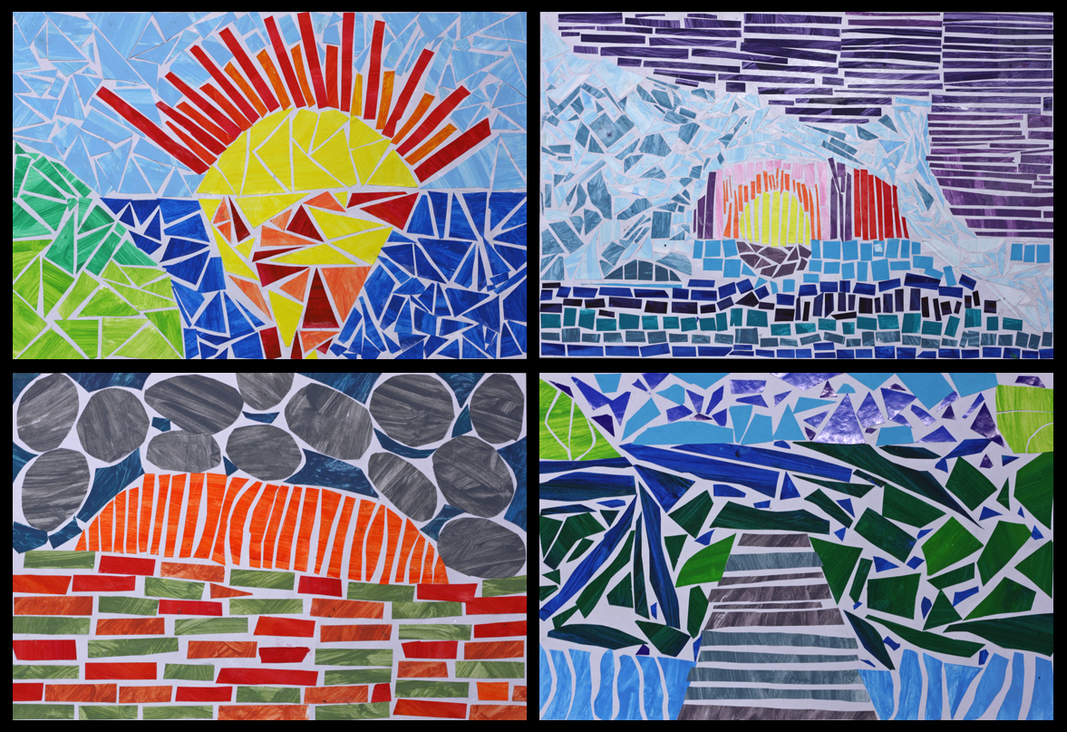
Mosaic Landscapes
Very intricate, very laborious but very rewarding art. They are (painted) paper mosaic landscapes courtesy of year 5 and 6. Most of the scenes depicted are directly inspired by landscape photographs, some are a fusion of different photos and a few are entirely imagined. Islands and icebergs, mountains and rivers, rocks, roads, oceans, jetties and sunsets—there's a great variety of scenery, and as with all good landscape art, it's very easy to stop and stare at these beautiful natural environments.
The first and probably most enjoyable part of the process was painting all the paper. We gathered a tonne of scrap paper (just regular old copy paper) and went a bit wild with the paint, making numerous colour mixes, tints and shades. The unprinted side of each A4 sheet was quickly painted one colour, then the mix was tweaked (darker or lighter or greener etc) and another full sheet was painted. And so the process continued until virtually every flat surface in the room was covered in dozens and dozens of differently coloured pieces of drying paper. Once dry, the paper was flattened underneath a pile of atlases (proving that a printed map is still more useful than a GPS!). The speed of the painting also left lots of visible brushstrokes, which made for a very textural look on the mosaics.
The students then made planning sketches based on a series of landscape photos that I showed them. I had a quick conference with each student and made sure that they had a strong composition that was distilled down to the basic shapes and free of overly intricate details (e.g. just foreground, mountain, sky etc). They also wrote down the colours they intended to use in each area.
Next they very lightly drew in some guide lines on their good piece of art paper. Finally they began the laborious task of blocking in each segment of their landscape by cutting and pasting down pieces of the paper we had painted previously. As well as deciding exactly where to place all those great colours, other goals included gluing each piece of paper so it didn't touch its neighbour, and also to rub out the pencil guides before they were immortalised in glue!
This cutting and pasting part of the process was quite taxing on their patience and admittedly the enthusiasm had waned for a few students towards the end... Hopefully it was patience-promoting rather than patience-demanding. It took around 5 weeks to complete and made for a fantastic class display at their school art show. Well done any 5/6 students who are reading this : ) I think that may be the first time I've used the word fantastic on this blog!
Aug 25, 2013
Primary Colour Gradients II
These primary colour gradients were painted by year 5 and 6 students. The process is simple but the results are striking. This is a slight variation on my original more detailed Primary Colour Gradient lesson. To read about the process involved please take a peek here.
This time around I supplied the students with cardboard shape tracers to cut out their chosen shape before sticking it onto the background gradient. Last time every child used a circle, but I realised that the results would be improved with more variation. What do you think?
Jun 16, 2013
Musical Moments Inspired by Paula Cox
These musical moments were made after year 4 observed this series of album covers created by British artist Paula Cox. The students created their own scenes in pencil, then traced the "good bits" with permanent markers before finishing with watercolour paint.
I like the variety of responses from the students and I think they have captured the emotion and simple joy of music much like Paula has. I always keep this lesson up my sleeve as a relief teacher, you can read more about the lesson process on my inaugural "Musical Vibes" post here. Another post featuring more oil pastel variations can be found here.
May 5, 2013
Cloudscapes III
A third instalment of cloudscapes. Some students in this 5/6 composite really dove in with reckless abandon, which was great to see, and admittedly a little scary at times! I am really impressed with the subtlety of some of the colours a number of the students created.
And as you can see below they really do make for a great feature on a classroom wall.
Subscribe to:
Posts (Atom)