Showing posts with label black and white. Show all posts

Aug 6, 2014

Manly Men


Men with facial hair, as illustrated by year one students with charcoal. Some of the technical terms in this very cultured art lesson included beard, goatee and moustache.

This is the first time I can recall ever using or having students use charcoal... Gasps of shock horror from the real art teachers out there - Who is this impostor?! I'm just a regular classroom teacher who likes making art in class, keen but naive : ) So any sagely words of wisdom, must dos and don'ts or other secret tips that you know about using charcoal please let me know in the comments below!


May 26, 2013

Paula Scher-inspired NZ


These collaboratively made maps of New Zealand were inspired by American graphic designer and artist, Paula Scher. Year 3 viewed a collection of her beautiful map art here. The land mass of NZ is made up of hand written words all to do with ‘Aotearoa’ (Maori for Land of the Long White Cloud). The children took turns copying from a word bank of around a dozen words with permanent markers. Originally there was a light pencil outline to guide the writing which was later erased. The writing wasn’t particularly legible but the overall effect is great! 

I really like art that looks great on the wall at a distance but also seems to have laser beams that drag you in for a close-up look. It’s interesting to see all the different writing and words and the ways they zig and zag and tumble over each other.

The black and white one is my personal favourite and is inspired by New Zealand’s national sporting colours. The teacher of this particular class was on leave to compete in a hockey tournament in New Zealand so it seemed like a good opportunity to combine a quick geography lesson with some art. Apologies to any Kiwis reading this who have zoomed in close and feel that our word bank is stereotypical or too limited! In the future I would really like to try this lesson with an older class and let each student choose a country to research and make a Scher-like map of art for.


Apr 21, 2013

Nine Lives


Each year 4 student created nine various pictogram-style people in black and white. They presented their collection as a 3 x 3 grid on a piece of coloured construction paper.

I was with this particular class for a full week and they mostly worked on these during early finishing time. Initially I brought up some examples on the smart board and they sketched ideas in pencil before transferring them in permanent marker onto the small squares of art paper I had pre-cut. I asked the students that each of their nine people be obviously different in some way.

It was a good way to occupy the students between other activities and I think they enjoyed the collective process. It's an effective way for them to manipulate positive and negative space too. This is the first time I've tried this lesson but I'm sure I will again in the future. I think it could also be a good opportunity to look at and imitate Keith Haring-style people, but this is a future lesson!

Mar 24, 2013

"Notanarama"


Each year 5/6 student began with a black square, triangle, rectangle or circle. Most of the class chose to cut more abstract rather than representational shapes, and then derived great pleasure from recognising incidental objects within their work. We were limited to using black paper (all the available coloured paper was single-sided), but black and white turned out to be very effective.

This was the first time I'd taught about—much less made—Notans (a Japanese design concept focussing on the relative placement of light and dark within a composition), and both myself and the students enjoyed the process. I hope I can make them with another class soon. I'd seen a number of Notan posts floating around the blogosphere, but the most recent one I recalled and studied up with was by Rina from the K-6 Art blog.

While you're here, have you entered the "Win a Joe Hall and The Treehouse Band CD" competition yet? It's as easy as pie, just recall a favourite childhood memory or pastime here. One week left to enter...


Oct 14, 2012

Blue Eyes - Green Eyes


These animal all-sorts were inspired by Bob Gill's The Green-eyed mouse and the Blue-eyed mouse. It's a neat story that my wife introduced me to earlier in the year. The art contained therein worked well as a springboard into this lesson, and the story's well worth sharing with children and adults alike. This was a fast paced lesson with the year 5 half of a 5/6 class while year 6 were on an excursion.

Large_9780714848877


Although these were painted it would be quicker and probably just as effective to draw them with permanent markers, but I do like paint... The students made some pencil sketches after observing a few of Bob's understated but endearing animals. Next they painted with regular black acrylic before adding their final blue or green eye colour. I don't think you'll be able to find all these in the wild, captivity or even a fieldguide - but it's great to see something brought to life from the animal kingdom of a student's imagination!


Sep 23, 2012

Zebrafied


We have a cluster of small artworks featuring Zebras on our sunroom wall. I had been thinking about fresh art ideas when I re-noticed them. I have been trying a number of ideas based on silhouettes lately and suddenly I saw yet another possibility – I decided to ask my students to “zebrafy” a chosen silhouette.

To “zebrafy”, I explained to the mildly bemused students, is to give any silhouette you choose the characteristic black and white stripes of a Zebra, and to make the white stripes disappear into the background or surrounding negative space. These are the impressive results of the first lesson with a year 6 class. I was excited by their responses and am confident I can better deliver the lesson next time, having ironed out a few kinks with this inaugural zebrafying. 


Once the students had a silhouette in mind they did some practice sketching before repeating their favourite outline in a light lead pencil on their art paper. It was to be large on the page and not overly intricate. Next they added their planned zebra stripes, still in lead pencil. To finish they painted in every second stripe black, and once dry erased any visible pencil lines (ie at the top and bottom of all white stripes). Hence the "white" stripes are just paper white rather than painted white.

Obviously it depends on the shape of the individual silhouette, but following are a few things I'll remember to make clear in future. Both the outside edge stripes need to be black and if there are any sharp corners or curves they will need to "happen" in a black stripe to prevent them disappearing from view. And to make sure an object doesn't get lost in the negative space behind I think it would be helpful to make the black stripes a little thicker than the white ones.


An eclectic collection of zebrafied silhouettes from radioactive warning signs to peace signs, animals to automobiles, hands, robots, guitars, skulls and freshly bitten ice-creams.


Aug 12, 2012

50/50 Silhouettes


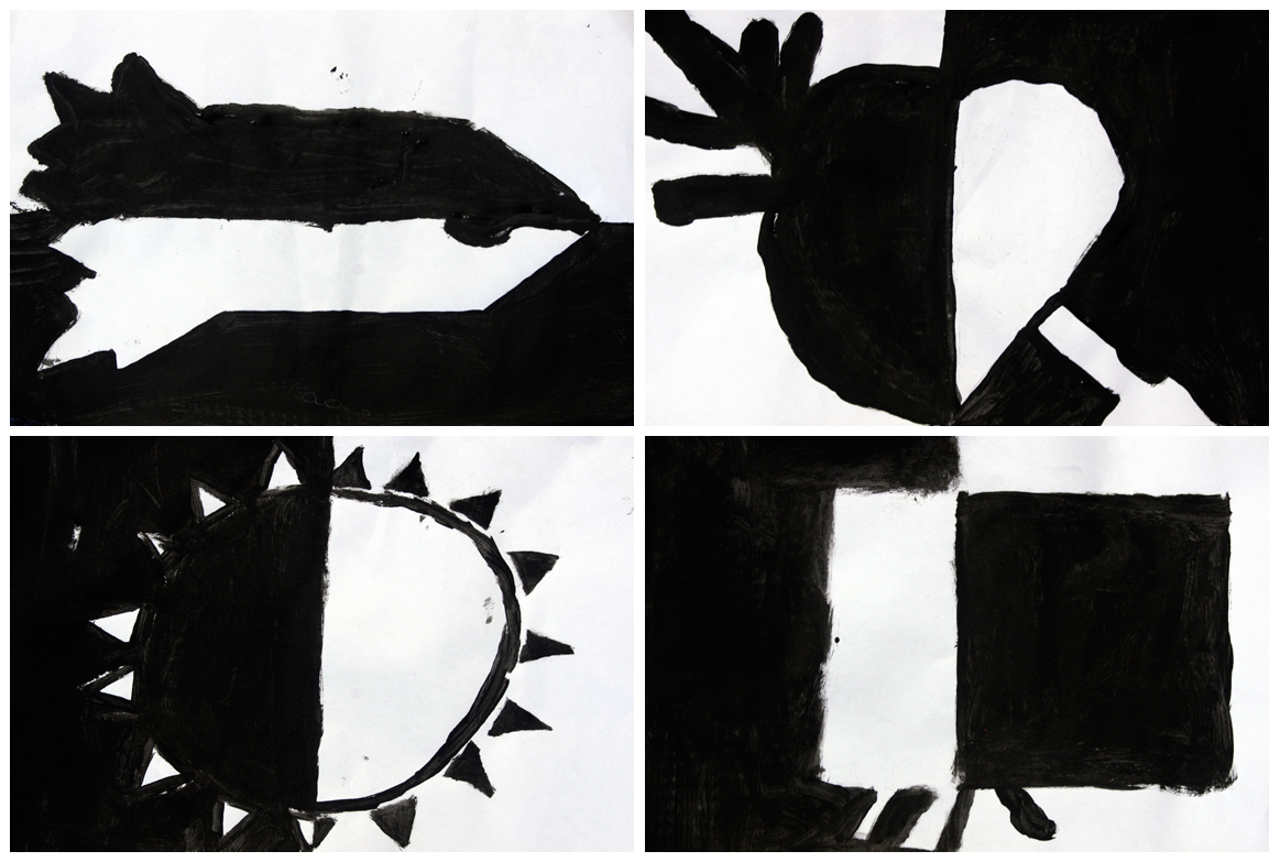
I've been trying a number of silhouette-based lesson ideas lately. I think they are effective in demonstrating how much can be communicated quickly with a simple blocked-in outline. Although a silhouette may be simplistic and stylised, even at a glance there is no mistaking a person, tree, car etc. These silhouettes were created by a year 5 class in about an hour. 

As with all my posts so far, I have included the art of every student, whatever the result — to give the best impression of how successful a lesson is. Every class will have at least one, if not a number of students who will create something special no matter what we say or do as teachers. So only showing the most adept students' work is probably not a true indication of how well a lesson works in a classroom setting.


To begin my first attempt at this lesson we briefly discussed and viewed some common silhouettes. Next I demonstrated the task of sketching a large silhouette and dividing it in two. One half was painted black, leaving a white background and then the other half of the silhouette is left white with a painted black background. The children planned their work on some scrap paper before penciling their outline onto the art paper and then moved to the painting table. 

I did bend my rules and allow some minor details rather than completely solid silhouettes, hence there are some facial features, windows etc. This was fine for most, but did confuse some with how to make each side opposite. I didn't insist on symmetrical silhouettes although obviously this is an option. Overall I'm really happy with the results and look forward to revisiting this idea. The students enjoyed both the process and results which for me is a pretty good indicator of a lesson's value.