It's been so long since I've posted and I'm saying so long too! Does "so long" mean goodbye in other parts of the world? It does here! I really enjoyed blogging about the great art kids were doing here on the Central Coast, but I became a bit distracted with my own three bundles of joy and also I started painting regularly myself. This has become my main creative outlet and I'm really enjoying it. I've included some of my paintings below to give anyone interested an idea of what I'm chasing... If you like what you see and you don't mind Instagram, you can always see more @_joe.hall_ I will keep checking in here with the art teaching blogosphere to keep inspired for my days at school, I'm always so impressed with both the teaching and what kids are capable of. All the best - Joe : )
Showing posts with label colour. Show all posts
Jun 2, 2018
Jul 22, 2016
Marcos Masks
A favourite year 5 class made these striking masks around 2 years ago, I'm more than a little late posting – and yes, I did just say favourite! ; )
We began with pencil, then used permanent markers and finished with some water colours. The masks are inspired by a Hallmark greeting card illustrator named Marcos Roman. I know this because I pretty much verbatim, used Don's excellent lesson on his always inspiring blog Shine Brite Zamorano.
May 13, 2016
Vertical Landscapes
Year one made these vertical landscapes in three steps. Initially I led a guided drawing lesson in pencil. Next, the students traced their "good" lines with black markers and did a little erasing. Finally they coloured them any way they chose with watercolour paint.
We had just completed a science unit of work about landscapes, and it seemed only appropriate to attempt this classic art form. I took inspiration from one of Kathy Barbro's many fine lessons on Art Projects For Kids. For any eagle eyes out there, please ignore the missing comma on the class display text!
Sep 15, 2013
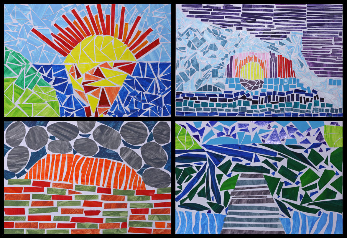
Mosaic Landscapes
Very intricate, very laborious but very rewarding art. They are (painted) paper mosaic landscapes courtesy of year 5 and 6. Most of the scenes depicted are directly inspired by landscape photographs, some are a fusion of different photos and a few are entirely imagined. Islands and icebergs, mountains and rivers, rocks, roads, oceans, jetties and sunsets—there's a great variety of scenery, and as with all good landscape art, it's very easy to stop and stare at these beautiful natural environments.
The first and probably most enjoyable part of the process was painting all the paper. We gathered a tonne of scrap paper (just regular old copy paper) and went a bit wild with the paint, making numerous colour mixes, tints and shades. The unprinted side of each A4 sheet was quickly painted one colour, then the mix was tweaked (darker or lighter or greener etc) and another full sheet was painted. And so the process continued until virtually every flat surface in the room was covered in dozens and dozens of differently coloured pieces of drying paper. Once dry, the paper was flattened underneath a pile of atlases (proving that a printed map is still more useful than a GPS!). The speed of the painting also left lots of visible brushstrokes, which made for a very textural look on the mosaics.
The students then made planning sketches based on a series of landscape photos that I showed them. I had a quick conference with each student and made sure that they had a strong composition that was distilled down to the basic shapes and free of overly intricate details (e.g. just foreground, mountain, sky etc). They also wrote down the colours they intended to use in each area.
Next they very lightly drew in some guide lines on their good piece of art paper. Finally they began the laborious task of blocking in each segment of their landscape by cutting and pasting down pieces of the paper we had painted previously. As well as deciding exactly where to place all those great colours, other goals included gluing each piece of paper so it didn't touch its neighbour, and also to rub out the pencil guides before they were immortalised in glue!
This cutting and pasting part of the process was quite taxing on their patience and admittedly the enthusiasm had waned for a few students towards the end... Hopefully it was patience-promoting rather than patience-demanding. It took around 5 weeks to complete and made for a fantastic class display at their school art show. Well done any 5/6 students who are reading this : ) I think that may be the first time I've used the word fantastic on this blog!
Aug 25, 2013
Primary Colour Gradients II
These primary colour gradients were painted by year 5 and 6 students. The process is simple but the results are striking. This is a slight variation on my original more detailed Primary Colour Gradient lesson. To read about the process involved please take a peek here.
This time around I supplied the students with cardboard shape tracers to cut out their chosen shape before sticking it onto the background gradient. Last time every child used a circle, but I realised that the results would be improved with more variation. What do you think?
Jun 30, 2013
Fauvist Animal Prints
A little while ago I walked over a concrete path that appeared to have a turtle print stencilled into it's surface, it made me think that some animal prints in nonrealistic colours would be a simple and memorable introduction to Fauvism. The students chose their own colourways and worked directly on the paper with no pencil lines underneath. The animal prints range from truly wild beasts like tigers and leopards, through to zebras, giraffes and the more sedate beasts like cows and even turtles.
Jun 9, 2013
Rosalie Gascoigne Inspired Collage
A talented and patient year 3 class are responsible for these great collages. They are inspired by Rosalie Gascoigne's Tiger Tiger. I first tried this lesson with a combined year 5 and 6 class last year. Both times the students and myself have been really happy with the results. There's quite a bit of work involved and there are some very thoughtful responses from these young artists. You can read more about the process involved and see the work of the 5/6 class on this previous post.
I like the variety of themes the students have chosen, from single and varied colours, to typography, people, transport, hairstyles and more. I commented to one young student that I really liked his collection of colours to which he replied "it's not a colour collection, they're all different dress fabrics..." I was even more impressed! Some might find it a little creepy, but I was also really impressed with the student who amassed a collage of different skin tones. As I mentioned the students were very patient, mostly I think students of all ages like fairly fast paced art lessons but this process is fiddly and laborious. Year 3 is definitely the youngest I'll repeat this lesson with : )
May 19, 2013
Either Or
I find that incorporating choice is a great way to help students be enthusiastic about an art lesson—often the more prescriptive a lesson is, the harder it is to engage students. Another great benefit of lessons with choice is that the resulting art is obviously more varied and interesting to look at—it's a bit unexciting to see a classroom wall adorned with up to 30 very similar artworks.
Recently I was with this year 3 class for a session in the computer lab. This simple "doodlish pattern" task included two basic choices. The first step (and choice) was to cover their page/screen/image in either straight or curvy lines. The second step (and choice) was to paint in the resulting segments using either all cool colours, all warm colours or all tints and shades of a single colour. As you can see a few students felt even that was too restrictive!
Feb 3, 2013
Recoloured Mondrians
Year 5 students created these Mondrian-like compositions with any three colours of their choosing. A few could not resist Piet's classic primary colourway, but others relished the chance to re-imagine his renowned style. Like this recent year 2 Mondrian lesson, the children ruled their own grids with permanent markers, but in this case used watercolours rather than acrylic paint to fill in their resulting squares and rectangles.
Oct 21, 2012
Designer Camouflage
This year 6 class was tasked with designing and painting their own camouflage print for a real or imagined environment — something to make them inconspicuous while traipsing through a Lego landscape, lolly shop or a far away planet etc.
The students dreamed up a location and suitable colourway, then quickly planned their shapes in pencil before setting about painting. Tints and shades were encouraged and I suggested a limit of 3 or 4 colours. Most students went for fairly typical interlocking organic shapes. Their environment/print titles were great, a few were: Pink Pop, Mercury Lake, City Summer Night, Swirly Sweets, Wacky Waves and even Sponge Bob!
Since this lesson occurred I've discovered Andy Warhol's camouflage prints from the 1980s. I wish I knew of them beforehand as they would have been great to show the class. You can see a collection of his prints and read some interesting commentary at this LA Times art review. It even includes a quote from Picasso, who on first seeing actual camouflage print during WWI reportedly declared "It is we who created that". I think this lesson has the potential to be even richer in the future.
Jul 29, 2012
Finger Paint Printmaking
These Kindergarten children had a choice of three warm colours or three cool colours. The regular classroom paint was spread directly onto their class desks by myself and then the students took turns at finger painting straight, curvy and zig-zag lines – one line type per colour. We made a single print from each. Once they were dried the children decided on the order and orientation they preferred for presenting their three prints. The shock, horror and pure joy of seeing their school desks smeared in paint and then painting with their fingers was a big hit with the students and they really enjoyed seeing their prints come to life as the paper was peeled from the table.
For me the really appealing part about these prints is the brush patterns created behind the finger lines. On a day when I'm feeling more adventurous I'd like to let the children be responsible for this part of the process too, and experiment with variables like more or less paint, sponges, squeegees etc. But as a relief teacher I'm always in someone else's room, with a class I don't know back to front, and in this case already with paint smeared over half their furniture, so I often end up erring on the side of caution... Perhaps I'll try this with an older class where the children are obviously up to the responsibility. I'm guessing that students of every age would relish the chance to get their fingers wet!
I first encountered this finger painted printmaking technique in a primary art teaching class while undertaking my undergraduate studies in primary education at UTS. Anne Bamford was our lecturer and I really looked forward to being in her art room each week, where the learning was always hands on. In hindsight I would like to have chosen visual arts as my major, oh well. I have kept a large folder of resources we made as part of that subject and still refer to it for inspiration. Looking through it a few months ago I was reminded of this very idea and had opportunity to use it only a few days later. And by the way, even once dry the paint easily comes off the desks with a wet cloth!
Jul 15, 2012
Hot & Cold
On the day I was with this year 2 class they were mid-way through a weather unit. It seemed a good opportunity to combine some art in their study by creating cool and warm magazine collages. I had only just previously spotted some blue/purple/green and red/yellow/orange collages at Riverside Elementary's blog.
As there wasn't time in the day for an entire art lesson this activity became (and worked very well as) a collaborative effort. Initially the collages were started by the fast finishers but then the whole class pitched in to help. The children scoured glossy magazines looking for any suitable colours, cutting them out and sorting them into their appropriate cool or warm group. Other students were busy arranging and pasting the cut-outs down. It was simple, it really underlined the two distinct colour groups to the children and was a great way to utilse some cooperative learning.
Subscribe to:
Posts (Atom)