Showing posts with label landscape. Show all posts

May 13, 2016

Vertical Landscapes


Year one made these vertical landscapes in three steps. Initially I led a guided drawing lesson in pencil. Next, the students traced their "good" lines with black markers and did a little erasing. Finally they coloured them any way they chose with watercolour paint.

We had just completed a science unit of work about landscapes, and it seemed only appropriate to attempt this classic art form. I took inspiration from one of Kathy Barbro's many fine lessons on Art Projects For Kids. For any eagle eyes out there, please ignore the missing comma on the class display text!


Apr 23, 2014

Textured Landscapes


Year 6 sketched the bones of these stylised and vertically-orientated landscapes in pencil and then traced over these with black textas before adding different repeating patterns in each section. The students used a combination of coloured pens, textas and pencils to achieve the textured appearance. 

This is a lesson I copied verbatim from Miriam at artescuola.com - it's one of my favourite blogs! I showed the children the work of Miriam's students on the other side of the world, which really helped to capture their attention. Some students copied the scenes they saw there, others were inspired by examples I made on the board and some created their own altogether.


Sep 15, 2013

Mosaic Landscapes


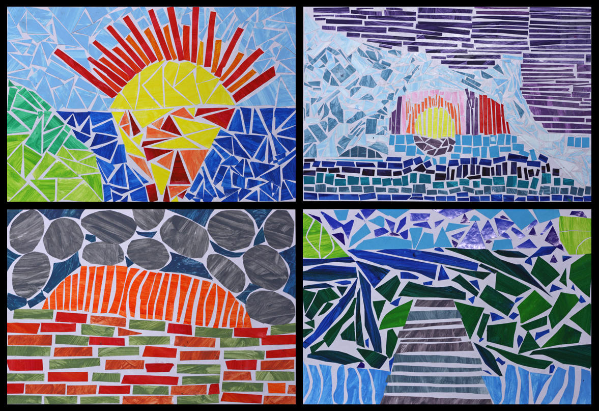
Very intricate, very laborious but very rewarding art. They are (painted) paper mosaic landscapes courtesy of year 5 and 6. Most of the scenes depicted are directly inspired by landscape photographs, some are a fusion of different photos and a few are entirely imagined. Islands and icebergs, mountains and rivers, rocks, roads, oceans, jetties and sunsets—there's a great variety of scenery, and as with all good landscape art, it's very easy to stop and stare at these beautiful natural environments. 


The first and probably most enjoyable part of the process was painting all the paper. We gathered a tonne of scrap paper (just regular old copy paper) and went a bit wild with the paint, making numerous colour mixes, tints and shades. The unprinted side of each A4 sheet was quickly painted one colour, then the mix was tweaked (darker or lighter or greener etc) and another full sheet was painted. And so the process continued until virtually every flat surface in the room was covered in dozens and dozens of differently coloured pieces of drying paper. Once dry, the paper was flattened underneath a pile of atlases (proving that a printed map is still more useful than a GPS!). The speed of the painting also left lots of visible brushstrokes, which made for a very textural look on the mosaics.


The students then made planning sketches based on a series of landscape photos that I showed them. I had a quick conference with each student and made sure that they had a strong composition that was distilled down to the basic shapes and free of overly intricate details (e.g. just foreground, mountain, sky etc). They also wrote down the colours they intended to use in each area. 

Next they very lightly drew in some guide lines on their good piece of art paper. Finally they began the laborious task of blocking in each segment of their landscape by cutting and pasting down pieces of the paper we had painted previously. As well as deciding exactly where to place all those great colours, other goals included gluing each piece of paper so it didn't touch its neighbour, and also to rub out the pencil guides before they were immortalised in glue!


This cutting and pasting part of the process was quite taxing on their patience and admittedly the enthusiasm had waned for a few students towards the end... Hopefully it was patience-promoting rather than patience-demanding. It took around 5 weeks to complete and made for a fantastic class display at their school art show. Well done any 5/6 students who are reading this : ) I think that may be the first time I've used the word fantastic on this blog! 


Mar 10, 2013

TTTPs (or Two Terrific TeePees)!


I'm always up for some alliterative fun : ) This year 2 class used textas to draw two tall (and terrific) teepees before adorning them with repeated patterns featuring triangles, lines, zig-zags, circles etc. To complete their teepee scenes they used watercolours to paint their background landscapes. Some teepees were set in front of sunburnt and dry desert-like landscapes while others featured lush green grass with far-off mountains.


I guess "Cowboy and Indian" movies, toys and the like aren't as prevalent these days—the children all being more familiar with subcontinental Indians than Native American Indians. Hopefully they'll now remember that the Native American Indian people are just like our Indigenous Australians, people who lived and thrived in these beautiful landscapes long before freeways, cities, factories and the rest.


Jan 27, 2013

10 min Value Landscapes


Like the Value Landscapes posted earlier this month, this lesson was inspired by Miriam at Arteascuola. However, these were "painted" with pixels on the computer rather than regular paintbrushes. Each year 4 student completed their own landscape in less than 10 minutes but still had valuable experience with using tone to create depth within a two dimensional artwork. 

After we observed and discussed the scenes created by Miriam's students the children took turns at making their own value landscape on the two available classroom computers while the rest of the class continued on with their set work. It was quick and easy but also meaningful for the children. 

Dec 16, 2012

Reduced Abstract Landscapes


I asked these students to envisage a naturally occurring land or sea scape and reduce it down to its simplest elements such as sky, water, sand and headland etc. These were sketched in pencil as simple uncluttered shapes which were then finalised in a permanent marker before each element was blocked in using watercolour paint. I asked for solid single colours within each element except for the sky which was to change from a light to dark tone as it rose from their horizon. I'm not sure but this may have been the first time this 5/6 class used watercolours this year. They did a great job.


This lesson was inspired by a snowboarding advertisement I had found online a few days previous. I showed it to the class, we discussed the simple alpine scene and how we would create our own (free of branding!). I said it could be any type of land or sea scape — many of the children chose a beach and headland scene not dissimilar from the one closest to their school (and one I drew on the board as an example...). In future I think I'd improve the lesson by having a large collection of landscape photos for the children to choose from, reducing it down to its core shapes and colours instead of imaging their own. It's a highly useful skill being able to recognise and distill something down to its most essential elements.


This is the advertising poster that inspired the lesson — it's not Monet I know but still worthwhile I think : )