I asked these students to envisage a naturally occurring land or sea scape and reduce it down to its simplest elements such as sky, water, sand and headland etc. These were sketched in pencil as simple uncluttered shapes which were then finalised in a permanent marker before each element was blocked in using watercolour paint. I asked for solid single colours within each element except for the sky which was to change from a light to dark tone as it rose from their horizon. I'm not sure but this may have been the first time this 5/6 class used watercolours this year. They did a great job.
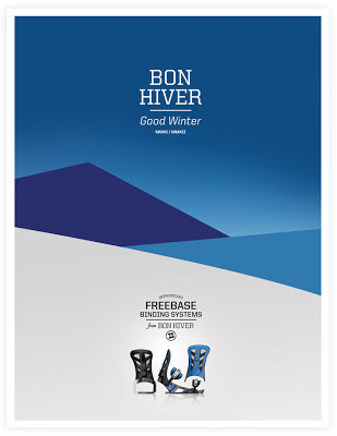
This lesson was inspired by a snowboarding advertisement I had found online a few days previous. I showed it to the class, we discussed the simple alpine scene and how we would create our own (free of branding!). I said it could be any type of land or sea scape — many of the children chose a beach and headland scene not dissimilar from the one closest to their school (and one I drew on the board as an example...). In future I think I'd improve the lesson by having a large collection of landscape photos for the children to choose from, reducing it down to its core shapes and colours instead of imaging their own. It's a highly useful skill being able to recognise and distill something down to its most essential elements.
This is the advertising poster that inspired the lesson — it's not Monet I know but still worthwhile I think : )


Your kids did a great job with your GREAT idea!!!!
ReplyDeleteBeautiful results.
ReplyDeleteYour students did a superb job.
Thanks guys! I know a few students from that class regularly stop by the blog to see when their art is posted and I'm sure they 'll be thrilled to read your comments all the way from the other side of the globe : )
ReplyDeleteinteresting¡ have a look at our school blog:www.pekearteleno.blogspot.com
ReplyDelete