Showing posts with label year 5. Show all posts

Jul 22, 2016

Marcos Masks


A favourite year 5 class made these striking masks around 2 years ago, I'm more than a little late posting – and yes, I did just say favourite! ; )

We began with pencil, then used permanent markers and finished with some water colours. The masks are inspired by a Hallmark greeting card illustrator named Marcos Roman. I know this because I pretty much verbatim, used Don's excellent lesson on his always inspiring blog Shine Brite Zamorano.


Jul 18, 2015

Newspaper Sculpture


Newspaper sculptures courtesy of year 5 in the final week of school last year. Inspired by my previous Geometric Sculpture post. I might have art directed the bottom left one a little more than the others... They all looked great and were a really effective collaborative task.

May 11, 2015

Manly Pop


Year 5 sketched their “manly” men (beards, goatees, moustaches etc!) in lead pencil and then charcoal. We used watercolour paint to add the “pop” by finishing with a single-colour background and another t-shirt colour. The effect is reminiscent of one of Warhol’s Marilyn prints, but obviously a lot more manly : ) 

I really like these, and they looked pretty rad on the back wall. You can see my previous Manly Men post courtesy of Year 1 here (sans the pop background).


Mar 13, 2015

Painted Light


In a dimly lit classroom, year 5 created these light paintings in small groups while I took long exposure photographs. The brightly coloured lights are a combination of small torches and mobile phones with coloured cellophane attached. I've tried this lesson once previously, you can read a little more about the process and see the results here.

Since undertaking this lesson I've come across a 1949 collaboration between Gjon Mili and Pablo Picasso using this same technique. One of their resulting photographs is at the bottom of the post. This and some other photos from the same series ran in LIFE magazine in 1949 and then also featured in a show at New York's Museum of Modern Art in 1950.


Jan 28, 2015

Ming Vases


Year 5 made these Ming Vase arrangements by closely following Miriam Paternoster's fantastic art lesson found here – I had been waiting for ages to try this project with a class! The only change worth mentioning is that I gave the students a variety of vase outlines to trace instead of drawing their own. This saved some time as it's a relatively time consuming, but engrossing project : )


Nov 27, 2014

50/50 Silhouettes II


These 50/50 silhouettes from year 5 are more graphic than fine art. I think a lot of graphic art often appears deceptively simple. I showed these students the same lesson as undertaken by a previous class who I first tried this lesson with (it's over here). Quite a few of these students took direct inspiration from my previous class, while others found their own ideas.

We drew in pencil and then painted all the black parts in acrylic. Once dry, I decided to add a step this time and paint the white/negative space a single colour of their choosing. We used watercolour paint for that final step – much quicker to work with and far easier to clean up : )


May 13, 2014

Kandinsky II


Some more pixel paintings inspired by Wassily Kandinsky's Farbstudie Quadrate from 1913. These are of course a collage of many students' work. The pieces immediately above and below are by year 5 and 6 students. Each student was responsible for six shapes. In the above collage, students made all their six shapes the same, whereas below each child used a selection of different shapes. Please click on the images to see the details more closely.


This second set was created by year one students. Each child was responsible for a single shape. The students featured above chose circular shapes like Kandinsky, while the children below used a variety of other shapes. For more information about the process and Mr Kandinsky, please see my previous post here.


Sep 15, 2013

Mosaic Landscapes


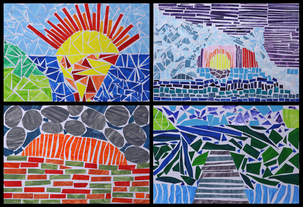
Very intricate, very laborious but very rewarding art. They are (painted) paper mosaic landscapes courtesy of year 5 and 6. Most of the scenes depicted are directly inspired by landscape photographs, some are a fusion of different photos and a few are entirely imagined. Islands and icebergs, mountains and rivers, rocks, roads, oceans, jetties and sunsets—there's a great variety of scenery, and as with all good landscape art, it's very easy to stop and stare at these beautiful natural environments. 


The first and probably most enjoyable part of the process was painting all the paper. We gathered a tonne of scrap paper (just regular old copy paper) and went a bit wild with the paint, making numerous colour mixes, tints and shades. The unprinted side of each A4 sheet was quickly painted one colour, then the mix was tweaked (darker or lighter or greener etc) and another full sheet was painted. And so the process continued until virtually every flat surface in the room was covered in dozens and dozens of differently coloured pieces of drying paper. Once dry, the paper was flattened underneath a pile of atlases (proving that a printed map is still more useful than a GPS!). The speed of the painting also left lots of visible brushstrokes, which made for a very textural look on the mosaics.


The students then made planning sketches based on a series of landscape photos that I showed them. I had a quick conference with each student and made sure that they had a strong composition that was distilled down to the basic shapes and free of overly intricate details (e.g. just foreground, mountain, sky etc). They also wrote down the colours they intended to use in each area. 

Next they very lightly drew in some guide lines on their good piece of art paper. Finally they began the laborious task of blocking in each segment of their landscape by cutting and pasting down pieces of the paper we had painted previously. As well as deciding exactly where to place all those great colours, other goals included gluing each piece of paper so it didn't touch its neighbour, and also to rub out the pencil guides before they were immortalised in glue!


This cutting and pasting part of the process was quite taxing on their patience and admittedly the enthusiasm had waned for a few students towards the end... Hopefully it was patience-promoting rather than patience-demanding. It took around 5 weeks to complete and made for a fantastic class display at their school art show. Well done any 5/6 students who are reading this : ) I think that may be the first time I've used the word fantastic on this blog! 


Aug 25, 2013

Primary Colour Gradients II


These primary colour gradients were painted by year 5 and 6 students. The process is simple but the results are striking. This is a slight variation on my original more detailed Primary Colour Gradient lesson. To read about the process involved please take a peek here.


This time around I supplied the students with cardboard shape tracers to cut out their chosen shape before sticking it onto the background gradient. Last time every child used a circle, but I realised that the results would be improved with more variation. What do you think?


Jun 30, 2013

Fauvist Animal Prints


Animal prints inspired by the art movement Fauvism. This year 5 and 6 class created them with oil and chalk pastels after viewing a collection of Fauvist artworks and recognising their trademark characteristic of strong, exaggerated and often nonrealistic use of colour. The name Fauvism was founded on the French word fauves meaning "wild beasts" (you can read more about the whys and wherefores here).

A little while ago I walked over a concrete path that appeared to have a turtle print stencilled into it's surface, it made me think that some animal prints in nonrealistic colours would be a simple and memorable introduction to Fauvism. The students chose their own colourways and worked directly on the paper with no pencil lines underneath. The animal prints range from truly wild beasts like tigers and leopards, through to zebras, giraffes and the more sedate beasts like cows and even turtles.


May 5, 2013

Cloudscapes III


A third instalment of cloudscapes. Some students in this 5/6 composite really dove in with reckless abandon, which was great to see, and admittedly a little scary at times! I am really impressed with the subtlety of some of the colours a number of the students created.


And as you can see below they really do make for a great feature on a classroom wall.


Apr 14, 2013

Abstract Mosaic Collage II


These eye-catching collages were created by a recent year 5 class. I first trialled this lesson last year with year 2. I've been really pleased with the results both times. As a relief teacher it's great to have ready-to-go lessons that work well across multiple age groups (and are even more engaging than colouring-in stencils!). You can see the original year 2 results and read more about the lesson process here.

I was really impressed with some of these colour combinations and especially with the student on the very top left who opted to use only blue and black while most used their full "allowance" of four colours!


If you're too stretched for time to visit my previous post and instructions, here's a short overview : ) Students choose between 1 and 4 colours, then free-cut and paste pieces of these coloured papers down, covering the white paper without the pieces touching each other.


Apr 7, 2013

Gorillas in the Art Room


A diverse collection of gorillas now stare down from this particular classroom wall – some menacingly so, others wearily or comically. After pencil sketching, the students finalised their line drawing with permanent marker before finishing with watercolours. These magnificent beasts are the handiwork of a talented year 5 & 6 class.

The original, ‘as-per-the-book’ lesson was for the teacher to lead a step-by-step line drawing of an identical gorilla. Instead, I searched online and found several different gorilla drawings to project on the smart board. Some of them were quite realistic while others were more stylised and even cartoonish. The students copied or took inspiration from one or more that either appealed to them or seemed manageable!


It's important to me that as often as I can, I allow the students ‘room to move’ and make their own art. In this case I was asking every student to draw and then watercolour a gorilla up close and personal with a hint of rainforest in the background. I tried to maintain some diversity with the variety of stimuli rather than a single source and made no restrictions on the colours they chose. 

I'm really glad I didn't limit them to realistic colours because blue gorillas look undeniably cool : ) A homage to the Cookie Monster perhaps? But at the same time, if every gorilla was blue they wouldn't look so special... So my ‘soapbox’ opinion for the week is that we should endeavour to include room for at least some individuality within all our art lessons.


Seeing some of the more unrealistically coloured gorillas reminded me of Fauvism and its emphasis on strong colours over representational or realistic ones. Then I noticed that the French origins of Fauvism appear to mean ‘the wild beasts’. In the future I'm thinking of another lesson where we observe some classic Fauvist artworks before creating our own wild beasts with exaggerated and bold colourways. And as per my quest for variety, if I'm dictating the colour scheme then I imagine the art will feature a diverse cast of animals instead. 


Mar 24, 2013

"Notanarama"


Each year 5/6 student began with a black square, triangle, rectangle or circle. Most of the class chose to cut more abstract rather than representational shapes, and then derived great pleasure from recognising incidental objects within their work. We were limited to using black paper (all the available coloured paper was single-sided), but black and white turned out to be very effective.

This was the first time I'd taught about—much less made—Notans (a Japanese design concept focussing on the relative placement of light and dark within a composition), and both myself and the students enjoyed the process. I hope I can make them with another class soon. I'd seen a number of Notan posts floating around the blogosphere, but the most recent one I recalled and studied up with was by Rina from the K-6 Art blog.

While you're here, have you entered the "Win a Joe Hall and The Treehouse Band CD" competition yet? It's as easy as pie, just recall a favourite childhood memory or pastime here. One week left to enter...


Mar 3, 2013

Cloudscapes II


These graphic cloudscapes were created by a year 5 class within their first few days of school this year. They were embarking on a weather unit to begin their studies and these were a great way to quickly brighten up the bare walls of the room. You can view my inaugural cloudscape post here

The students painted these with regular acrylic paint after viewing a diverse selection of cloud photos including sunsets and sunrises, storm clouds and much more. I think there must have even been some aurora borealis in there judging by a few of the colours! Some students also added some subtle oil pastel the following day. I really enjoy the variety of responses from the students.


The three grids of nine artworks that I've used meant that the 28th student was left all alone... I hope they don't mind! To make up for it I've copied and rotated the photo of their cloud four times resulting in the symmetrical pillow-like cloud above.