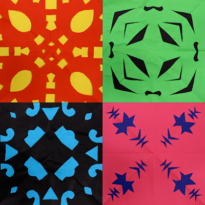
This is a great lesson for those in-between times. Paper cutting is quick, easy and effective. Plus the students love it – one recent class literally broke into applause as I unfolded my example before their enraptured eyes! No kidding : ) Click here for some previous examples and the instructions on my first such post. These particular ones were created by an enthusiastic year 3 class.
I've found the children learn more and are frustrated less when they begin with some practice attempts on scrap paper before using this research and development to make their deliberate final cuts on their coloured square.
I'd love your opinion on the display of this artwork. Please let me know which is your favourite method? The top grid of 4 is the way I most commonly display art here on the blog, but it's a looong scroll for some viewers to take them all in. I like to include every student's art as an indication of the success of the lesson across the varied levels of ability and enthusiasm within any given class.
The second way is the patchwork you see above with every student's art pasted together in one image (including one artwork repeated twice to make a rectangular number). The individual artworks are seen on a smaller scale but look really neat altogether.
The third and newest way is the potentially seizure-inducing 'gif' below! It briefly flashes through every child's artwork and runs on a continual loop. The image quality and colour is not as high as the previous jpgs, but every student's art is potentially right there near the top of the post. Gifs are not widely loved, but I thought I'd at least give it a try... It's also possible to adjust the amount of time that each image is shown for.
Realistically I'll try and keep using a variety of ways to present the artwork. But I really would appreciate any comments, feedback, preferences etc. I've got big shoulders and thick skin : )
Insert drumroll here... With all her wifely wisdom, Katherine has declared that everyone's a winner! From North America to New Zealand, congratulations Don, Phyl, Mrs Hahn, Mary, Jen and Gretchen. I'll catch up over email and get some postal addresses to send the cds to. Thanks a bunch for sharing : ) The competition's over but if you feel inspired to add your own childhood memory please do.


First, the cuttings are gorgeous together! Kids always think it's amazing when you open up the paper to see the results! I like the way you displayed the work in the first two pictures. They look great together and I can see the details well. Sorry but i don't care for the one that moves... the pictures change too quickly for me to really look at them... potential headache(sorry) maybe if you got it to change at a much slower pace so you could get a good look at the pieces...
ReplyDeleteThanks Mrs C, I think you're right - if I do use a gif again down the track I might experiment with a much longer time for each image. That's 'if' I use a gif again! : )
DeleteCool!Thanks!!
ReplyDeleteAs for the artwork posted, the 'quilt' looks really cool, and when you click to enlarge, you can get a good look at the individual squares. But that wouldn't work as well for more complex artwork; it's the implicitly that really makes this image so striking! As for the crazy gif - NO! I had to scroll away from it as quickly as possible, because it definitely bothered my brain!!
By the way - because my blog was attacked by an assault of spam,, my email address is no longer on my profile. So I'll give it to you here. You'll have to remove spaces, change the word 'dot' to an actual dot, and the word 'at' to the @ symbol. Sorry for the inconvenience.
Here it is:
Plbrown3 at yahoo dot com
Thanks Phyl, I know what you mean by having to avert your eyes from the gif! Thanks for the feedback : )
ReplyDeleteThat's Wonderful Joe!
ReplyDeleteI'm a sucker for a combination style of display. (If only I had a larger number of students) I like to highlight a couple pieces individually and then display a collection. But you always do a great job showcasing your students' art.
Thanks Mary : )
ReplyDeletemixin it up is great. i don't do it nearly enough on my own blog. i think the group collection is fantastic. i'm a sucker for that kind of display. whenever i do something textiley i think about a quilt like display for them.
ReplyDeleteand thanks for hooking me up with a cd!
Thanks Don and no worries : )
ReplyDeleteThey all look great together, the colours are totally fab...really love the moving images too, exciting
ReplyDeleteMe encanta!! muy bonita la combinación de colores, original, juvenil y divertido!!!
ReplyDeleteLove, love your ideas....my students are very young, but I will modify !,
ReplyDeleteHello Mr Hall, I loved your patch work of paper cut outs so much that my 4yr old and I are going to attempt something similar to decorate her art book for school.
ReplyDeleteCheers, AT
I personally think the gif is a great addendum- quick- attention grabbing.
ReplyDeleteI'm working with 3, 4 & 5th graders integrating math and art- this is great for symmetry ! Love the contrast of colors and the black background, too- love it ALLLllllllllllllllllL. thanks for posting. Pam in Illinois