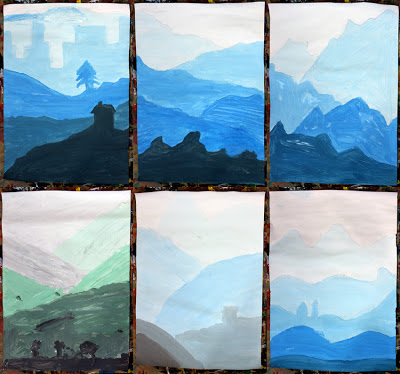
These value landscapes were directly inspired by Miriam on her Arteascuola blog. I visit it frequently and always find great inspiration — make sure you stop by! These were created by a year 5/6 class. They marked out their sections lightly in pencil and painted from the top down. Each student started with a small cup of white paint and little by little added their chosen colour so each layer would become darker. Most students also added some black to the final layer or two where the scenery is darkest and most pronounced.


Love this.
ReplyDeleteAlso, I just nominated you for a Premio Dardos blog acknowledgement (award), although I think you may already have received one of these. Check out my blog for details.
Thanks Christie : )
ReplyDeleteThese are fantastic works! I think that this exercise is very difficult, because when children mix the colors is not easy to stop adding the darker color at the right scale of value... I found so difficult to explain it to my student of year 6 and 7! Really you did it with year5? It’s depend on the teacher!! and I know you are one of the best!
ReplyDeleteThanks Miriam, but you and your students have paved the way and done all the hard for me! I showed the class your students' work and straight away they were very enthusiastic to try their own : )
ReplyDeleteI love this exercise as an alternative to the value study self portraits I typically do. I'm going to use it in an adult class (with paint) for a faster but still meaningful introduction to mixing values. Thank you for sharing your work!
ReplyDelete